Nobody is Perfect


When you do a renovation you want to do it perfect. Like a perfect cake or a perfect picture. But you are not perfect, nor is a renovation. - Especially when you follow the renovation work from far far away like I do.

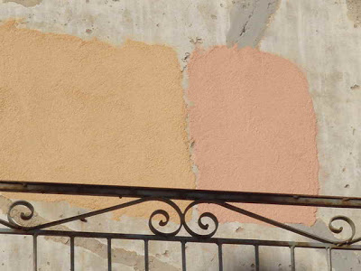
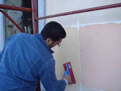
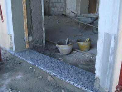
So the above picture stands for the first wrong decision we made. Or for the first decision we did not make.

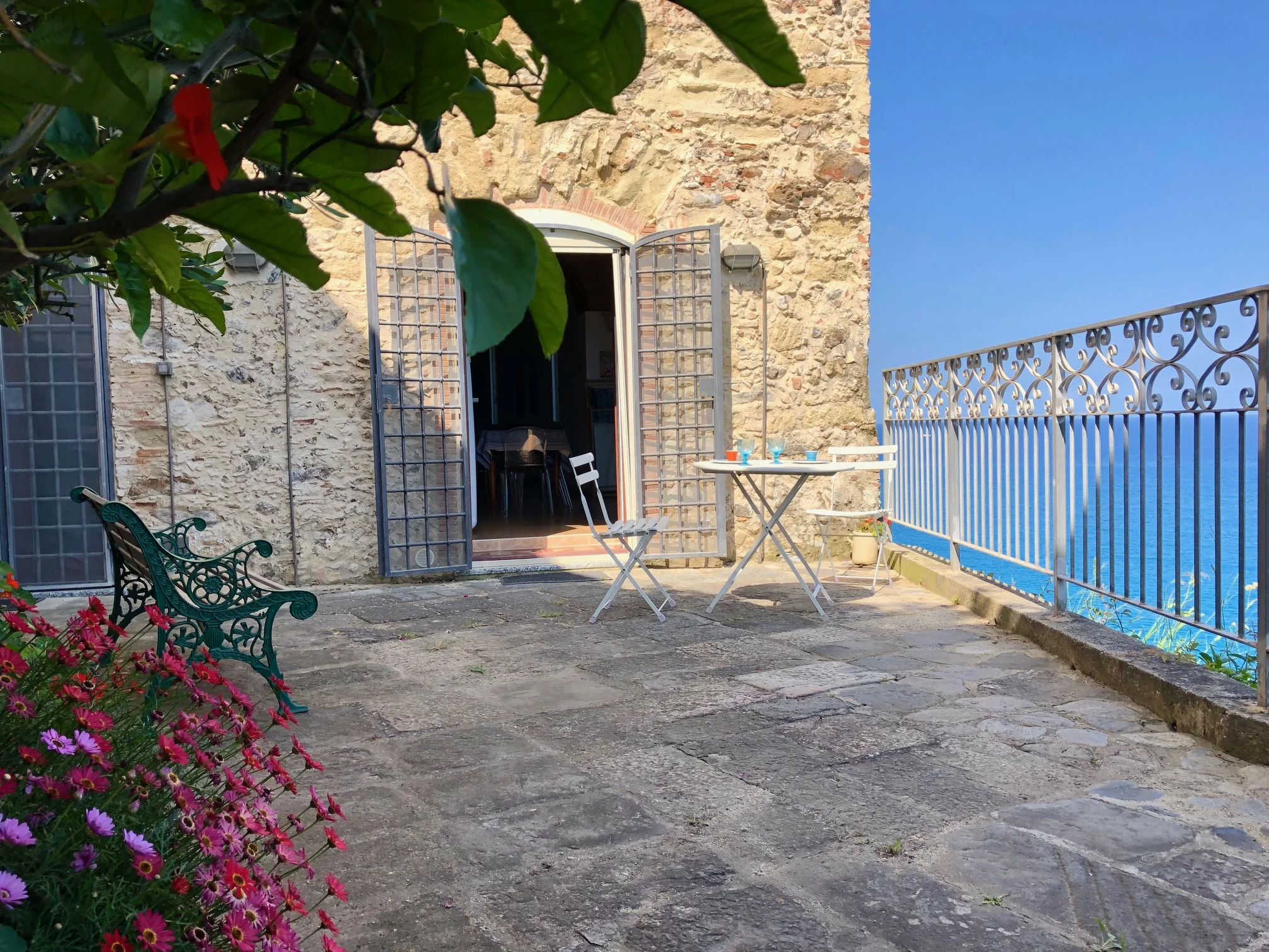
We saw the granite stone plates on top of the balustrade of the terraces. We did not like it much, but said, okay, we can life with that. Not too bad. Why change it when it is already there. And more granite plates were laying under the roof. They were bought by the former owner who wanted to renovate the house but did not finish. We did not realize that these pieces were for the windowsills and door sills. Somehow we knew, but apparently we forgot about them. Then, do you remember, we bought these wonderful blue tiles for the terrace that looks like the Calabrian sea and the sky at the same time? - Now our Calabrian sea has to end at these door sills. They look like my grandfather's tomb slab. They do!

I hope I will be able to life with that (of course there is worse in life!) But we could have easily ordered new sills in a more neutral tone, some broken white tone. I hope I will not think about graves or wrong decisions whenever I walk over these sills. It looks Especially when the stone is wet, it looks ... stop!

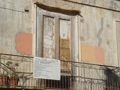
Look: In the next picture it seems not too bad. It shows the actual status of the renovation of the roof terrace.


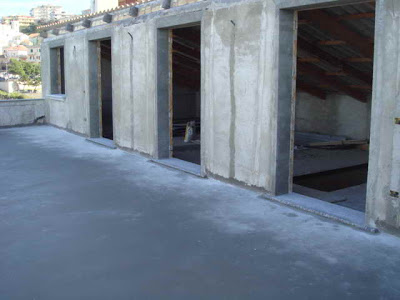
You might say: hey, it is not too late, take them out! Now!
Sigh. Tough decision. I am not on site to realize the actual effect. Maybe it is not too bad after all.

The good news is, that we will be on site in about three weeks!!!! And then I will know more. I can't wait to see everything in person, although Angelo emails us half dozen pictures every day. GRAZIE! BTW, these two pictures were mailed by him today.

Happy New Year !

We are back in Beijing and left the jet lag behind.

I am busy working on an article about my friends house here in Beijing. The editor asked me to rework it and talk more about design and less about my friend... First, I thought that as a reader I would like to read about the people in home stories, - and second, I do not know how to write about design in that perfect way some of the blogging designers do. - The editor's key words are: "white, European, clean lines, modern, fun"

I am sharing today my favorite pics I did at my friends place:


And more can be find at my flickr photo set (I will leave it open to public view for a few days).

So what do you think? What is your first impression? What key words would you use?

When I have done that job, I will be back here to post some Palazzo Pizzo related before and after pictures!

**************
UPDATE:
You can read about the article in my Beijing blog here or the article itself in the magazine here, page 48 ff.

Happy Holidays!


We are taking a break.

Angelo will travel back from Calabria to Venice by car. And then from Venice to Stuttgart by plane. I will be in Stuttgart tomorrow, arriving from Beijing by plane.

The world seems so small.

My son sees the picture of the renovation in Italy on the computer in China.
He got so inspired that he built a house in his kindergarten (above picture).

We will discuss colors and more renovation issues during the holidays and will be back on this blog soon.

Happy Holiday, Buon Natale, Frohe Weihnachten!

Pink Pigment's Problem?


All comments and emails I got vote for pink! The pink of a 'pale rose', 'faded coral' or 'Aurore's cheeks'!

But today I received the email of my renovation experienced Italian friend (mother-in-law's cousin's wife). She said the following:

"In my opinion I prefer yellow because pink colour with the time is making some horrible black stripes along the windows and it's not fine to be seen.
Right near my house (ed. remark: between Padua and Venice) there's a pink villa that looked beautiful when it was finished but, after a few years, they are renovating it because of this dirty look.

Someone told me that there's a pigment in the composition of pink colour which gives this black result when time passes by. I don't know if that's the reason, but now I'm careful about all pink houses that I see and I must say that it's true.
By the way, we did our house in yellow "ocra" and I'm happy of our choice."

So I am wondering what is it about that pigment?
The two photos above show houses in Pizzo. They look newly painted - and impeccable.
But when I look at our house ... dark stripes ....

We will ask around. Maybe some of you know?