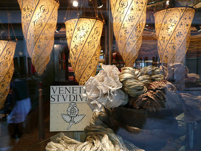
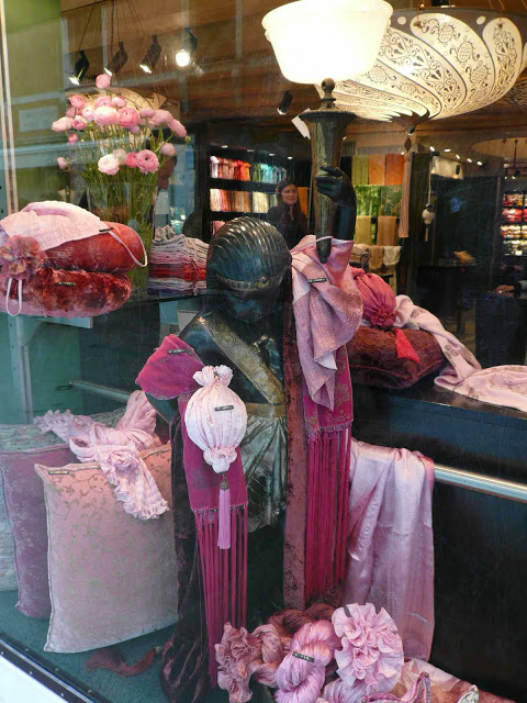
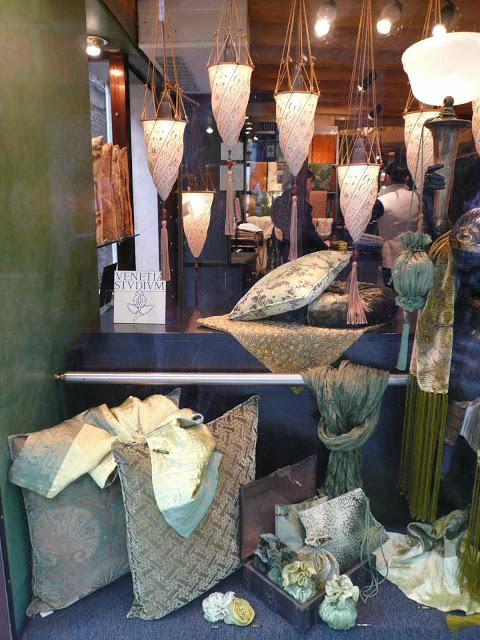
playing with colours
/
Today, I see rain, and I see sunshine. I see large rainbows, and colourful autumn leaves. I am thinking of colours and colour combinations - for doors, walls, rooms.
Since a while, I am collecting, researching and observing all around colours. Of course this leads unescabably to Le Corbusier and his use of colours in architecture and interiors.
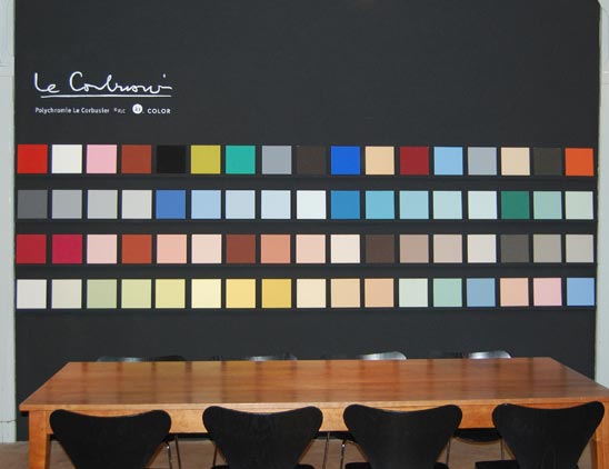
Here, you see the 63 colours from the colour palettes LC 32 and LC 43 by Le Corbusier :

Le Corbusier’s sophisticated color theories, outlined in his Polychromie Architecturale writing (Le Corbusier Polychromie architecturale: Farbenklaviaturen von 1931 und 1959 / Color Keyboards from 1931 and 1959 / Les claviers de couleurs de 1931 et de 1959 (German, English and French Edition), were influenced by his experiences as both an artist and an architect.

The color palettes he selected for a Swiss wallpaper manufacturer (Salubra) were systematized in chromatic ‘keyboards’ with accompanying cut-out cards. This tool will help to isolate color combinations.
The LC 32 series are organized into groups based on mood, from which a smaller palette of three to five harmonious colors can be selected.
The stronger colors of the LC 43 series appear on one page, with color proximity and the cut-out cards enabling selection for two to three vividly contrasting colors.

This sounds like a perfect tool box to find the most interesting colour combinations. Probably there are combinations, we would not even have thought of. But the price of this book (299 Euro!) scares me off. I will have to trust my own feelings, intuition and experience.
In case you are interested to know where to source these colours for your own painting project:
The Swiss based company, kt.COLOR, founded by the chemist Katrin Trautwein, is a highly specialized manufacturer of fine paints for interior use, licensed the exclusive rights to manufacture the original Le Corbusier colors from Foundation Le Corbusier in 1999.
- a dark dramatic entrance creates a contrast to brighter rooms
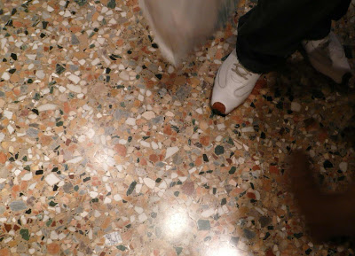
- a dark (painted) floor makes a room appear wider
- for small dark room: use no white but bright sunny colour
- grey is an elegant and cosy wall colour for a bedroom
Since a while, I am collecting, researching and observing all around colours. Of course this leads unescabably to Le Corbusier and his use of colours in architecture and interiors.
Here, you see the 63 colours from the colour palettes LC 32 and LC 43 by Le Corbusier :
Le Corbusier’s sophisticated color theories, outlined in his Polychromie Architecturale writing (Le Corbusier Polychromie architecturale: Farbenklaviaturen von 1931 und 1959 / Color Keyboards from 1931 and 1959 / Les claviers de couleurs de 1931 et de 1959 (German, English and French Edition), were influenced by his experiences as both an artist and an architect.
The color palettes he selected for a Swiss wallpaper manufacturer (Salubra) were systematized in chromatic ‘keyboards’ with accompanying cut-out cards. This tool will help to isolate color combinations.
The LC 32 series are organized into groups based on mood, from which a smaller palette of three to five harmonious colors can be selected.
The stronger colors of the LC 43 series appear on one page, with color proximity and the cut-out cards enabling selection for two to three vividly contrasting colors.
In case you are interested to know where to source these colours for your own painting project:
The Swiss based company, kt.COLOR, founded by the chemist Katrin Trautwein, is a highly specialized manufacturer of fine paints for interior use, licensed the exclusive rights to manufacture the original Le Corbusier colors from Foundation Le Corbusier in 1999.
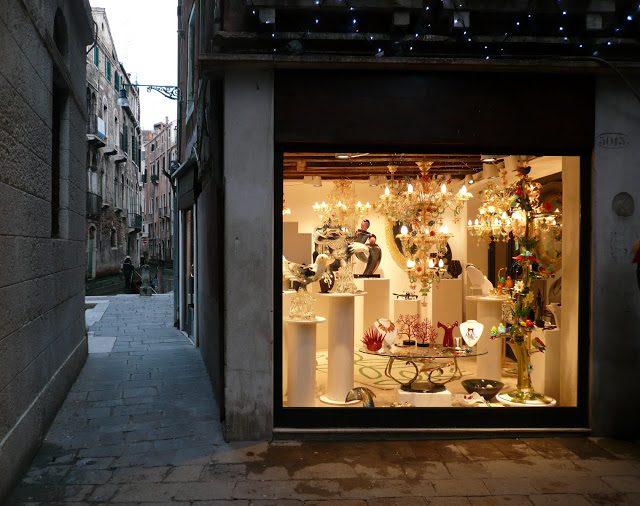
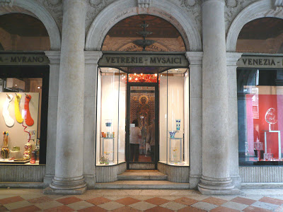
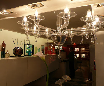
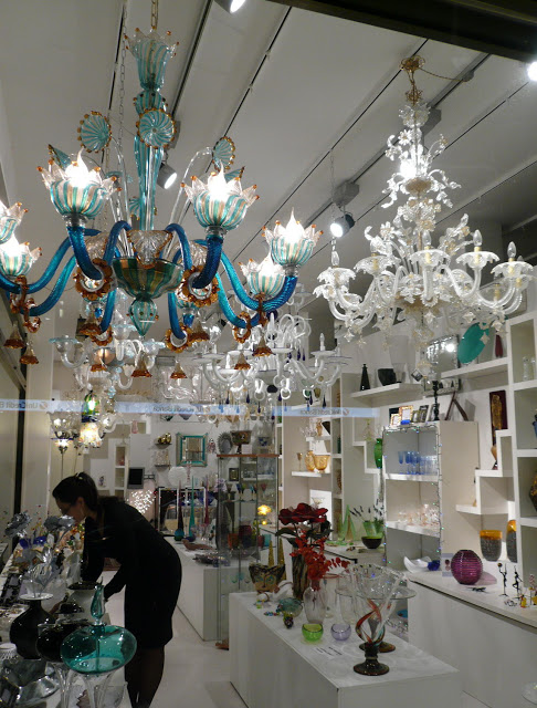
kt. COLOR showroom
- a dark (painted) floor makes a room appear wider
- for small dark room: use no white but bright sunny colour
- grey is an elegant and cosy wall colour for a bedroom
----
You might also be interested in: Le Corbusier's colour experimentation