Decorating with Colours


Maison Jaoul (finished in 1955), Neuilly (Paris) by Le Corbusier
(photo from a book "Le Corbusier" by Taschen)

If you have a house with many white walls and surfaces and not that much art work to hang, the best way to decorate your house is to paint large surfaces with bold warm colours that are rich in contrast.

Lately I got inspired by my friends new house. She used a Feng Shui colour consultant and ended up with a colourful house that radiates warm and cosy feelings from the very first moment, although the moving boxes were still unpacked. The result is quiet interesting and I have to ask her if I could post some pictures. In some rooms walls were painted with three different colours. Seems too much to me, and many others. Lets wait and see until they have lived in there for a while. But also magic colour tricks made disappear corners and widen small windows.

And since I need to add 3 doors for buil-in closets in my (German) home, I think to use bold colours for the surfaces. At the moment I fancy a kind of lobster red for a single door for my bathroom. And around the corner, in my home office, I fancy some fresh green or blue or yellow for a double door. As the 3 doors are so close to each other (the sliding door to the bathroom is always open) they can create a fun colour contrast. A bit of "Bauhaus" style in my appartment...


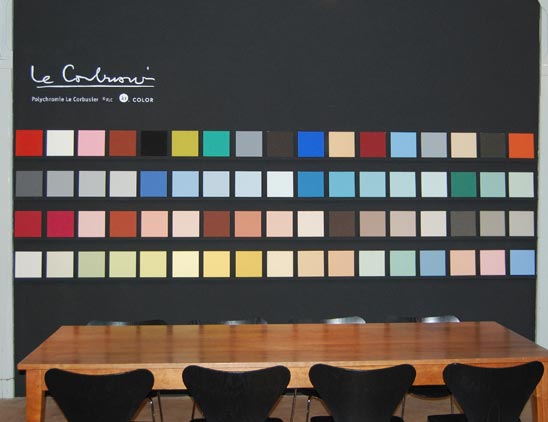
I played a bit and matched the above 3 colours (via Farrow & Ball).
This colour combination was often used in the 50ies by architects and designer.


very similar colour match in a loft in Paris via Cote Maison (photo by Philippe Garcia)


"arty" colours of the 50ies (jade, coral and yellow) used in a French appartment via Cote Maison


more interior of maison Raoul (via "Le Corbusier" by TASCHEN)


bedroom in maison Raoul (via flickr)


One more time the Claude and Duval factory by Le Corbusier (via wallpaper) to show the colour combo that keeps me fascinated.


Mediterranean Escapes - online eye candies by TASCHEN


Leaf through "Great Escapes Mediterranean" by TASCHEN - online !


click on "leaf through"


302 pages of eye candy online - better than any magazine !
Although the writing is too small to read the book online - my eyes are more than happy !


Hotel Stella Maris, north of Portofino, Liguria, Italy
(click on above pictures to enlarge)


 Mykonos Grace Hotel, Mykonos, Greece

Did this excite you ? Please help yourself and browse this book at TASCHEN.

Taschen was founded in Cologne, Germany in 1980 by Benedict Taschen to sell his comic collection. Today his company is known internationally for producing great value coffe table books about art, architecture, lifestyle and design. I will introduce you to more soon.

Le Corbusier colour experimentation

Le Corbusier (*1887-1965), mainly known as an architect, also worked as a painter and writer. His creativity seems endless. Between planning houses, villas and cities, he designed furniture, sculptured, published books, studied and traveled a lot. He was born in Switzerland as Charles-Edouard Jeanneret and started to use his pseudonym "Le Corbusier" only in 1920 after founding a magazine.

Recently I bought a book about this fascinating artist - and I am impressed by Le Corbusier's use of colours, his choice of quantity / proportion and contrasts - thus I thought I blog some of his interior related work.

The online version of wallpaper magazine recently published an article about Le Corbusier's Claude & Duval "Dream Factory" in France.

Here an extract:

(...)
The factory, a true architectural gem, was designed according to the famous Le Corbusier modular system, also featuring his intense block colour experimentations, covering ceilings and walls, to the plumbing system, contrasting heavily the naked concrete used as the main material.


Le Corbusier’s Claude & Duval factory in St-Die-des-Vosges was built in 1952 and has been a working textile factory ever since. This factory produces today high fashion pieces for the likes of Balenciaga, Chanel, Celine and Belgian designer Ann Demeulemeester, who owns her own Le Corbusier designed house in Antwerp. 
(...)

Text and photo source: wallpaper

---
You might also be interested in: playing with colours - Le Corbusier's colour palettes and "tool box"

playing with colours

Today, I see rain, and I see sunshine. I see large rainbows, and colourful autumn leaves. I am thinking of colours and colour combinations - for doors, walls, rooms.

Since a while, I am collecting, researching and observing all around colours. Of course this leads unescabably to Le Corbusier and his use of colours in architecture and interiors.

Here, you see the 63 colours from the colour palettes LC 32 and LC 43 by Le Corbusier :


Le Corbusier’s sophisticated color theories, outlined in his Polychromie Architecturale writing (Le Corbusier Polychromie architecturale: Farbenklaviaturen von 1931 und 1959 / Color Keyboards from 1931 and 1959 / Les claviers de couleurs de 1931 et de 1959 (German, English and French Edition), were influenced by his experiences as both an artist and an architect.


The color palettes he selected for a Swiss wallpaper manufacturer (Salubra) were systematized in chromatic ‘keyboards’ with accompanying cut-out cards. This tool will help to isolate color combinations.

The LC 32 series are organized into groups based on mood, from which a smaller palette of three to five harmonious colors can be selected.

The stronger colors of the LC 43 series appear on one page, with color proximity and the cut-out cards enabling selection for two to three vividly contrasting colors.


This sounds like a perfect tool box to find the most interesting colour combinations. Probably there are combinations, we would not even have thought of. But the price of this book (299 Euro!) scares me off. I will have to trust my own feelings, intuition and experience.

In case you are interested to know where to source these colours for your own painting project:
The Swiss based company, kt.COLOR, founded by the chemist Katrin Trautwein, is a highly specialized manufacturer of fine paints for interior use, licensed the exclusive rights to manufacture the original Le Corbusier colors from Foundation Le Corbusier in 1999.

kt. COLOR showroom


At Farrow & Ball's website I found the following useful hints:

- a dark dramatic entrance creates a contrast to brighter rooms
- a dark (painted) floor makes a room appear wider
- for small dark room: use no white but bright sunny colour
- grey is an elegant and cosy wall colour for a bedroom

----
You might also be interested in:  Le Corbusier's colour experimentation

Shopping in Venice: VENETIA STUDIUM

In the heart of Venice you might come across a little shop that has beautiful silk lamps, handbags and scarf, elegant velvet cushion covers and table runners in modern and oriental style. The shop windows always magically attracts me and my husband. And you can read the magic Roman letters : VENETIA STVDIVM - which is the Venetia Studium company that has several showrooms all near San Marco square.


Fortuny silk lamp "Cesendello" on the rod and silk scarves.
We like the style of the lamp, that is influenced like all the Venetia Studium products by the "history of Venice and its links to the Byzantium and the East".  However, we have no idea (yet) where to use it. Actually we look at this lamp as long as we visit Venice together, since over 13 years!


Scarves, shawls, handbags and cushion covers made of silk or velvet - and the elaborated glass lamp Saraceno.


Another Venetia Studium shop with similar window display ...


... and another shop specialised in cushion covers and table runners
Here my friend from Bangkok needs to shop for a friend in Thailand (that's why I saw all the shops!)


Little detail: I especially liked the typical Venetian terrazzo floor
(and the interesting Italian shoes of an Italian male)

PS: Venetia Studium has a showroom in London and selected products can be ordered online
*