4 favorites in my kitchen

In my actual kitchen - in Bangkok - I have four absolute favorite "accessories":
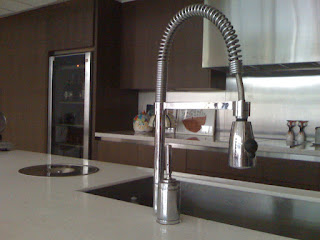
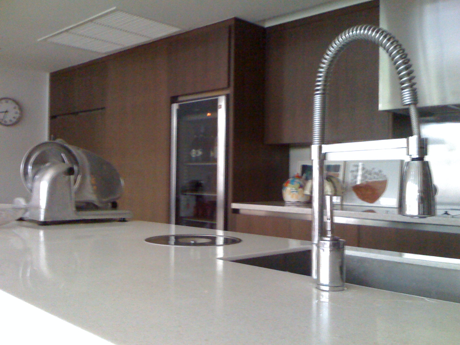
4 Favs

They are all four in the above picture - can you tell? From left to right:
  1. our electrical cutting machine - it is a farewell gift from our dear friends and neighbours back in Germany (via eBay) - we use it quite often to cut ham and salami from Italy.
  2. the large and very cool wine cooler ! I love the tenant for being so thoughtfully... we do not only store lots of wine but also chocolate at a temperature of 19 degree. A must in tropical climate! (by Miele)
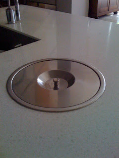
  3. a garbage bin (by Franke) accessible from top of the workbench. It is a 12 l bin and comes in handy every day.
  4. the professional flexible faucet dispenser (looks like Flex by Franke)

I like the gadgets on the kitchen island: garbage bin and faucet

the lid of the 12 l bin (by Franke)

And here comes maybe the most strange information from Thailand: 

We do not cook in this kitchen. If we cook after all. Usually, the maid cooks and she cooks in the "Thai" kitchen, since what you see in the picture is the so called "Western" kitchen. Yes, it is quite common in Thailand to have two kitchens in a household. One for the "expats" to cook, if they like - and one for the "heavy" Thai cooking (garlic, oil, curry...).

If you have a house, a Thai kitchen is not even inside the house. And as this one kitchen would do for Thai families, there is often a second cooking possibility when the property is rented to Westerners.

In our case, we are lucky. We found a very modern condo with very modern, Zen like, interior design. That's why our Western kitchen is so luxury. But wait - luxury? In one point these developer and designers are still very Thai: there is no hot water ! In none of our kitchens. And no dish washer. When I complained (and asked to move the boiler from the guest toilet to the kitchen), they just said: "Cannot" and: "In Thailand we use soap". - But I love my 4 favorites!

Focus on Kitchen


That's the actual situation: a niche with a hole for the hood. The balcony access that should not be blocked by the kitchen island. I think a kitchenette or L-shape with our stand alone 2 door inox fridge on the right (below the glass bricks). And it looks like we better have shelves instead overhead cabinets on this front!

In only two weeks from now I have to pack... we will fly to Italy ! The main purpose why we are doing this trip - in between a skiing holiday in Europe and our summer holiday in Italy - is because we need to make some major decisions, and this is about the KITCHEN !!!

The kitchen, not only in Italy, is the center point of the house. Nowadays, there are mainly open kitchens planned in new houses or remodelled in old houses. Kitchens are connected to dining and living area by just a kitchen island. Friends and family gather together around the kitchen before, during and after cooking and eating. Kitchen islands play a key roll. They are not only the new "border", they provide additional working space, they offer useful storage and often feature appliances. With stools they can be used as breakfast area, laptop work area - to check recipes ;-) or simply invite for an aperitif to accompany the cooking.

You all know that, and I am not a kitchen seller. This is just to remember, how important it is to choose the right kitchen design! It should matches the style of the house, especially the dining and living area.

That means for us a balancing act:

Our house is some 200 or 300 years old. We do not have a dining area yet. It will be a sleek long wooden table for sure. Chairs, not decided yet. Modern and comfortable for sure. Two modern sofas, we have shipped in from China, they are "close" to the modern B&B Italia style. We love inox steel appliances. We have a bulky 2 doors inox Siemens fridge (shipped in from China, hope it still works!). And we plan to have an inox oven and stove from Arniston or Smeg with inox hood.

Country style could work, but a bit more modern and maybe glossy surfaces would be nice too.

So I sat down, yesterday, and clicked through my kitchen resource links (on my new resource link page) and also browsed through my "kitchen briefing" file. But before it gets colourful and glossy here, I post our before and after layout and the kitchen planning drafts :

When we bought the house, we had the above layout at the ground floor (piano terra): a small kitchen with access to the balcony and a small bathroom. But big rooms all around. That's why we tore down all walls and moved the bathroom into another area.


The "after" layout: the displaced bathroom gave new space to the kitchen. Initially the plan of the architect suggested to have the fridge in the middle of the room, to somehow separate the dining area visually from the kitchen. We will, however, not follow this idea, and install the 2 door fridge just opposite the balcony. (front 4,50 m long, side about 3,40 m until door)

With a drawing by myself (see further below) and a rough layout of the ground floor we went to a kitchen company in Beijing that was quiet modern and very "Italian". The above plan is what they made for us.

And that is the front, seen from the dining area. The balcony would be on the left side.

Above, my changes in red: We have a niche with a hole in the wall that will be the place for the oven, stove and hood (as before). The fridge should be closer to the sink and work space to make moves more efficient - according to the kitchen triangle. The island needs to be just a minimum space away from the fridge and not too close to the balcony door to allow easy and barrier-free walking.  


My drawings :-)


If over head cabinet, then maybe only on the left of the fridge or a full-length pull-out-cargo

We could look for a simple island solution. But meanwhile Angelo organised "water" access for the island in the middle of the room, which means we could have an extra sink in the kitchen island. This is of course always useful. However, the island will be small - and I would love to have enough space there for breakfast. I think two stools there or three - and enjoy the sea view (this you can't when sitting at a lower table).

The next post will be about kitchen again, but this time glossy photos for inspiration!

---
PS: In case you wonder why I ship things in from China to Italy - we lived in Beijing 2005-2008 and everything there is so tempting cheap!

PPS: Did you notice, I slightly changed the layout of my blog by adding "pages" below the header. How do you like the change? Does the blog loads still okay or is it slower? And how about the "read more..." button, is it disturbing to have to click to continue to read or is it okay? Thanks for giving a small feed-back :-)    

Before and After: Basement with Balcony

Our house has a basement, that we call our seminterrato, which means "half under earth" or souterrain. Our seminterrato, however, is very special: On one part it is really underground, carved into the rock, on the other side it has fantastic 180 degree see view 54 meter above sea level! And it has access to a small garden with a lemon tree, a fig tree, a bougainvilleas and some cacti. It did not have a balcony though. But this has changed. Angelo is always good for surprises. Now we have a balcony in our basement. It is a balcony for two people with shoe size 40 or so.... but look the transformation from before with no balcony and rusty wrought iron balustrade to after with small balkony and restored balustrade in blue (!) :

BEFORE in August 2006

in between in 2009
(...) 


iron rail painted blue

balcony railing moved further out to obtain a small balcony above the new haven

Angelo demonstrating the use of the new balcony

I am saving this post to a new label "guest residence". Our basement is beautiful, it is my favorite part of the house (actually, I cannot decide which floor I like best, they are all amazing). But since the house is too big for us alone it makes sense to rent our part of it. The only part that can perfectly be separated from the rest of the house is the seminterrato. It has its own entrance. It will have two bedrooms, a bathroom with sea view, a pantry kitchen with balcony and a garden. I already envy my guest... ha ha! Of course we also have one guestroom upstairs, but this can only be used for family and friends while the guest apartment can be rented out to vacationer spending some time in Pizzo.

At the moment we are working on the insulation of the floor and walls and will post new pictures soon. 
Meanwhile you can find more about the progress of the guest residence or seminterrato here.

Walls with Stripes

nautical stripes via flickr
Since Heather from concrete jungle in Phuket commented on my last post that she pictures wide blue stipes for the walls under the blue ceiling, I got totally hooked with stripes on walls.

Yesterday, I skyped with Angelo and told him the idea ... his first comment was: "come?!" (what?!)  He asked me to make a drawing for him to better understand.

But first of all I had to think, vertical or horizontal stripes? While I thought about two or three bold wide blue horizontal stripes, my consultant from neighbouring Phuket thought wide vertical stripes. And to get some inspiration I googled "stripes wall" and "Streifen Wand" in German, and got plenty interesting results. Some of them I have to put in this post, but first my latest drawing, sorry I am not a professional interior designer and the scanned sketch comes out a bit pale, but you can see the four walls of the corridor :

two bold blue horizontal stripes under a blue ceiling in a small corridor

The photos that Angelo sent me yesterday are not really ideal to picture the corridor and to photoshop in the stripes, but I did it anyway and in both horizontal and vertical direction:

two horizontal stripes of different width, they could go around all four walls (except on the doors)

five vertical stripes - probably nice if only on the long wall with no door

The last vertical stripes make the room appear higher, which is not necessary. The horizontal stripes could make the small space appear larger, which could be more useful. But not only do stripes something to the space regarding the size, it also adds an interesting touch. Vertical stripes look more elegant, horizontal more unique. I like also the geometrical modern touch they add to the rather playful classic ceiling. But above all, I like the blue stripes idea because it's nautical ! It adds a beach house touch (to my beach house).

I checked the international nautical flags :

two blue stripes: J for Juliet or "on fire!"

And here are my favorite vertical wall stripes :

blue stripes in corridor, via Elle Decor


blue and white stripes, equally about 10 cm wide

stripes from wall to ceiling, different width

Tiffany blue wide wall stripes

Forrow & Ball paint, stripes about 10 and 20 cm wide

interesting fresh colour match

dashing arrangement of orange, grey, black and white stripes by Designer Sheila Bridges, via Elle Decor

same colour mix, same room as above

black and white stripes French style (white border around hooks and ceiling!)

nautical stripes via flickr

And here some of my favorite vertical stripes:

Vibrant orange-and-pink stripes race down the bedroom-corridor walls of designer Muriel Brandolini’s Victorian weekend house in Southampton, New York, via Elle Decor - THIS is about our corridor, but we have doors too...


very wide blue stripes

these two stripes in our blue could do

a wallpaper, too bold for living in

stripes of different width, strange deco though - but this is about our blue and could be our arrangement (the grey would be our light apricot) - but this here is a wallpaper

light gray stripes in a cozy beach house bedroom, via Coastal Living

a bold white stripe below the ceiling makes the room appear less high - light blue paint by Schoener Wohnen (D217), bed linen by IKEA

nautical stripes via flickr

what a difference a blue stripe makes !

I know, painting stripes, no matter which direction, is a lot of work (measuring, taping), but Angelo has proven a hidden talent. And as you see far above, I thought of two stripes only, maybe even only on one short wall. Let's see what Angelo says. And what do you think?

Sources:
since I found so many different photos it was too much to collect all the sources, some are from DIY sites or wallpaper shops - the best source, however, with even more inspiration is Wall Treatments: Say it with Stripes by Elle Decor

----
UPDATE:
And here is our result:


see other pics here

Of course Angelo could not resist and try out horizonatal AND vertical stripes. These are different areas, but connected. It is a fun optical detail, a surprise for the visitors eyes. 

Blue Ceiling by Angelo

Today I receive a blue ceiling via email :


And the text massage goes like this :

The ceiling of the corridor in front of the ground floor bathroom. I missed the blue after so long time! Is that ok? What color do you want the walls? White? Light yellow? Light ocra? Light pink?
Ciao
Angelo
Ah, I have missed Angelo's humour. I almost forgot about his "blue" addiction, didn't thought it's that strong! I wrote back that I like it. Light blue makes the ceiling appear higher - not that this was necessary in our case - but here the blue leads the eye towards the center. You do not notice right away that the ceiling is not symmetrical. And I really like that simple Art Nouveau lamp. We had it in storage so far - can you believe that? ... it never had a place to beam. Not sure though, if this short side corridor is the right place. We might have a better spot, but will see. Regarding the walls I opted for just white paint as this is a small and rather dark corridor. If this is too boring we can repaint it later.

I am happy with this Wednesday mail by Angelo. Grazie!