Inspired by Living in Argentina
/
It is not Italy, but maybe the South American country with the most European touch. Many Italians came here to live and you can feel the influence.
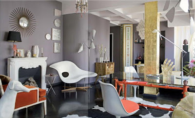 walls : grey, floor : black, column : gold, lamps : 6, accent colour : coral
All above beautiful images and many more can be found in this book :
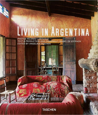
I browsed this book online here because my blogger friend N. was so excited about Buenos Aires after she spent a couple of weeks in Argentina. And I heard other people saying that Buenos Aires is a mix of Paris and Barcelona. So I got curious and checked this book by Taschen (language: German, English, French) which of course is not a travel book but purely about interiors. However, these eye-candies make me want to travel to Argentina right away.
And that's what the editor says: Argentina considers itself the most European of South American countries as Argentineans have a strong connection to the old world. When it comes to decorating, they have a great talent for bringing together the old and the new, with subtle touches of color and rich textiles.
Photo source: Taschen
walls : grey, floor : black, column : gold, lamps : 6, accent colour : coral
wow ! what a glamorous eclectic mix !
 curtains used as closet door and room divider
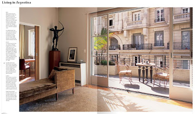
Buenos Aires, the Paris of South America
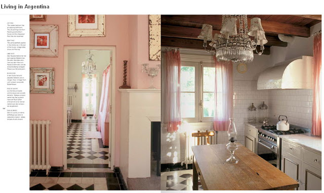
countryside house in Argentina (reminds me of a "maison de campagne" around Fontainebleau)
All above beautiful images and many more can be found in this book :
available via :
Amazon.com (19.79 USD)
or
Amazon.de (19,99 Euro)
I browsed this book online here because my blogger friend N. was so excited about Buenos Aires after she spent a couple of weeks in Argentina. And I heard other people saying that Buenos Aires is a mix of Paris and Barcelona. So I got curious and checked this book by Taschen (language: German, English, French) which of course is not a travel book but purely about interiors. However, these eye-candies make me want to travel to Argentina right away.
And that's what the editor says: Argentina considers itself the most European of South American countries as Argentineans have a strong connection to the old world. When it comes to decorating, they have a great talent for bringing together the old and the new, with subtle touches of color and rich textiles.
FYI : in case you order this book or any other product via my amazon links I receive about 5% commission through their associate program. In this case about 50 cent ... so if you order 10 copies, it would buy me a coffee !! (ha ha! thanks !)
Photo source: Taschen