Happy New Year !
/
We are back in Beijing and left the jet lag behind.
I am busy working on an article about my friends house here in Beijing. The editor asked me to rework it and talk more about design and less about my friend... First, I thought that as a reader I would like to read about the people in home stories, - and second, I do not know how to write about design in that perfect way some of the blogging designers do. - The editor's key words are: "white, European, clean lines, modern, fun"
I am sharing today my favorite pics I did at my friends place:


And more can be find at my flickr photo set (I will leave it open to public view for a few days).
So what do you think? What is your first impression? What key words would you use?
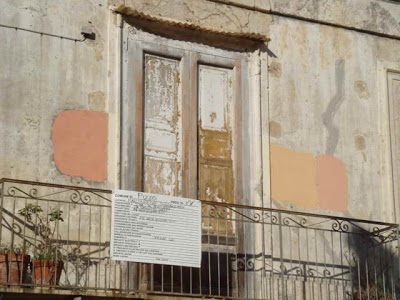
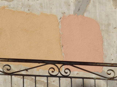
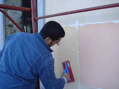
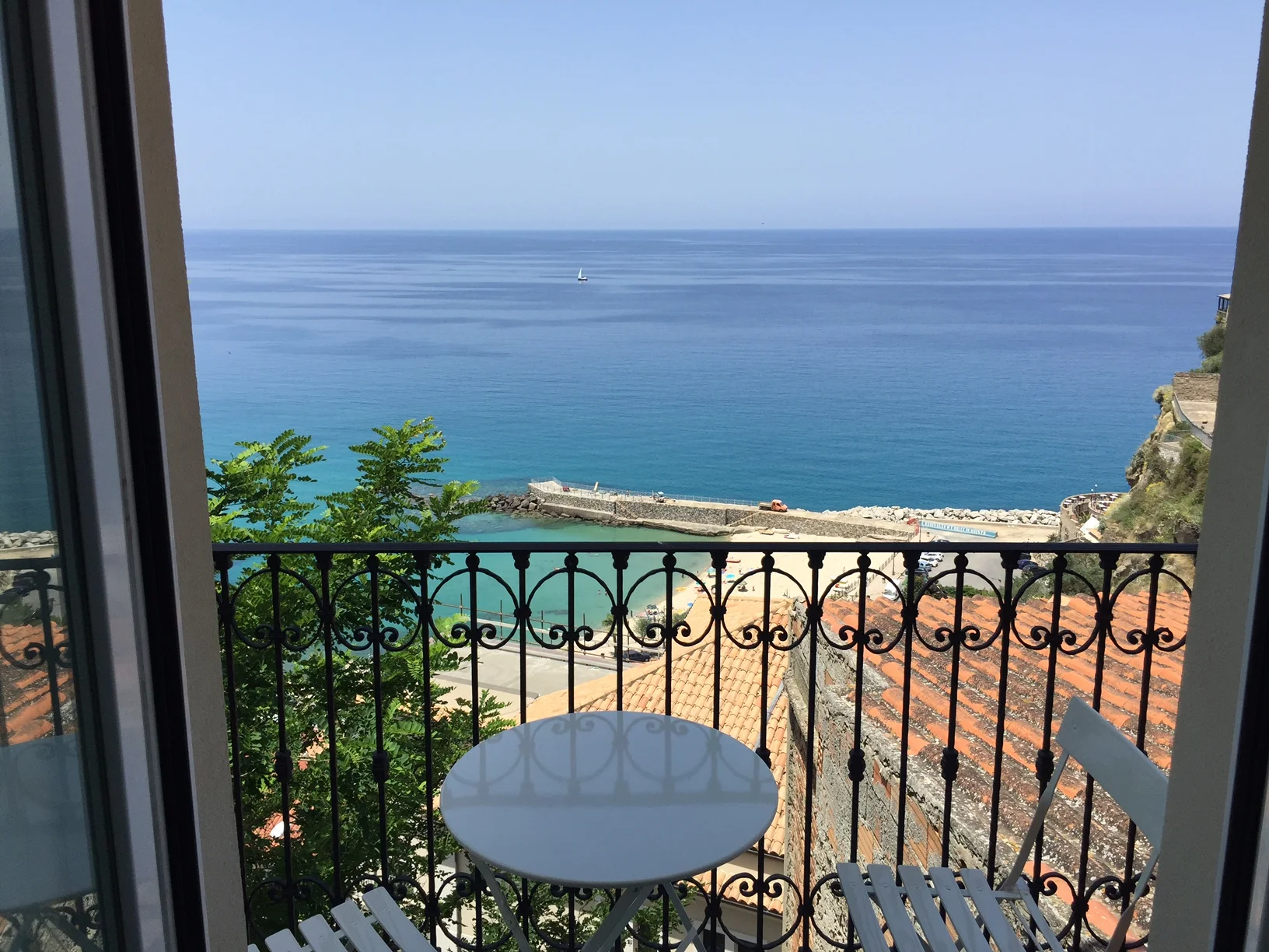
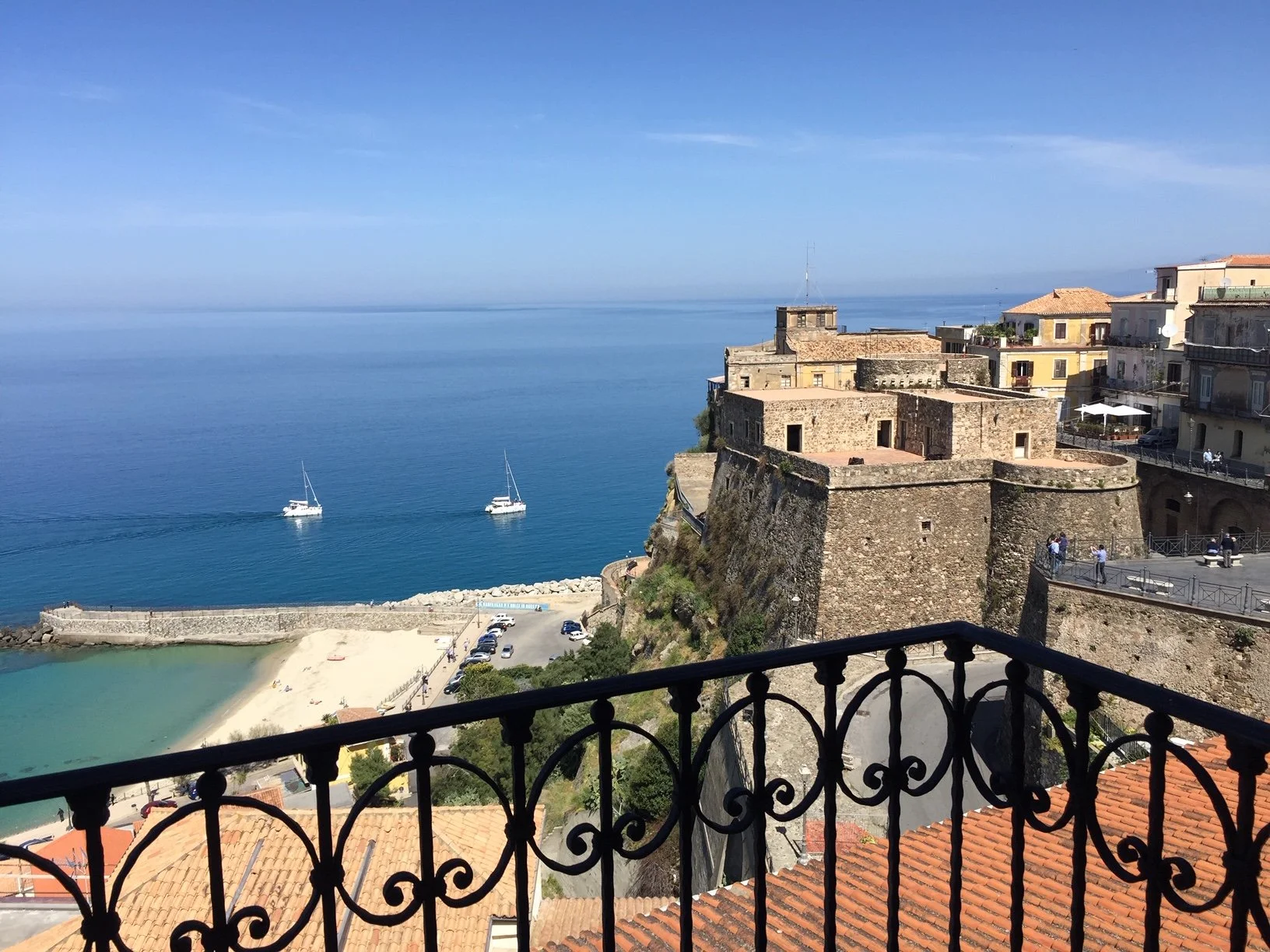
When I have done that job, I will be back here to post some Palazzo Pizzo related before and after pictures!
**************
UPDATE:
You can read about the article in my Beijing blog here or the article itself in the magazine here, page 48 ff.
I am busy working on an article about my friends house here in Beijing. The editor asked me to rework it and talk more about design and less about my friend... First, I thought that as a reader I would like to read about the people in home stories, - and second, I do not know how to write about design in that perfect way some of the blogging designers do. - The editor's key words are: "white, European, clean lines, modern, fun"
I am sharing today my favorite pics I did at my friends place:
And more can be find at my flickr photo set (I will leave it open to public view for a few days).
So what do you think? What is your first impression? What key words would you use?
When I have done that job, I will be back here to post some Palazzo Pizzo related before and after pictures!
**************
UPDATE:
You can read about the article in my Beijing blog here or the article itself in the magazine here, page 48 ff.